
THE ASB BRAND
DEFINED
Our brand reflects who we are. It honors our past, serves our present, and promises strategic vision for our future. These standards provide a shared foundation for identity, helping us present a clear, confident, and unified brand at every touchpoint. When applied consistently, we strengthen brand recognition and build trust across the market.
DEFINED BY
IDENTITY
Our identity is the most recognizable expression of our brand. It begins with the logo, which represents the face of our company. Designed to create clarity, consistency, and lasting recognition, each element plays a distinct role — working together to ensure American Solutions for Business shows up with strength, confidence, and cohesion in every environment.
The ASB logo mark is our primary and most recognizable identifier. It should be used in the majority of applications and serves as the anchor of our brand identity. Simple, confident, and distinct, it represents the strength and clarity of the ASB brand. When in doubt, lead with this logo.
THE ASB LOGO
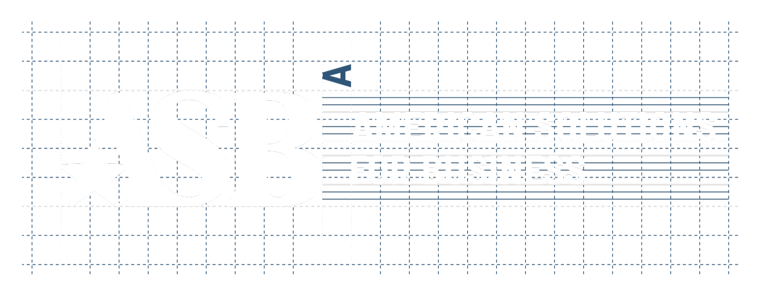
ASB COMBINATION MARK | HORIZONTAL
The horizontal combination mark pairs the ASB logo with the full company name in a streamlined, left-to-right layout. This configuration works well in applications where horizontal space is available, such as website headers, presentations, stationery, and signage. It provides clear identification while maintaining a balanced, professional appearance.
ASB COMBINATION MARK | VERTICAL
The vertical combination mark stacks the ASB logo with the full company name, creating a more compact footprint. This configuration is ideal for formats where vertical space is preferred or horizontal space is limited, such as posters, social graphics, and promotional materials. It ensures the full company name remains visible while maintaining strong brand recognition.

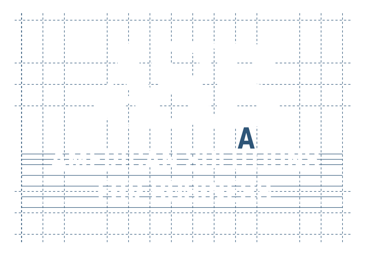
The A symbol is a supporting brand element derived from the primary logo. It may be used within a square, circular or as a stand alone element to reinforce recognition and add visual interest across materials. The symbol should never replace the primary logo, but instead serve as an accent that strengthens the overall identity.
THE “A“ SYMBOL
Learn how to properly protect the integrity of the ASB logo by reviewing our Incorrect Logo Usage guidelines.
DEFINED BY
COLOR
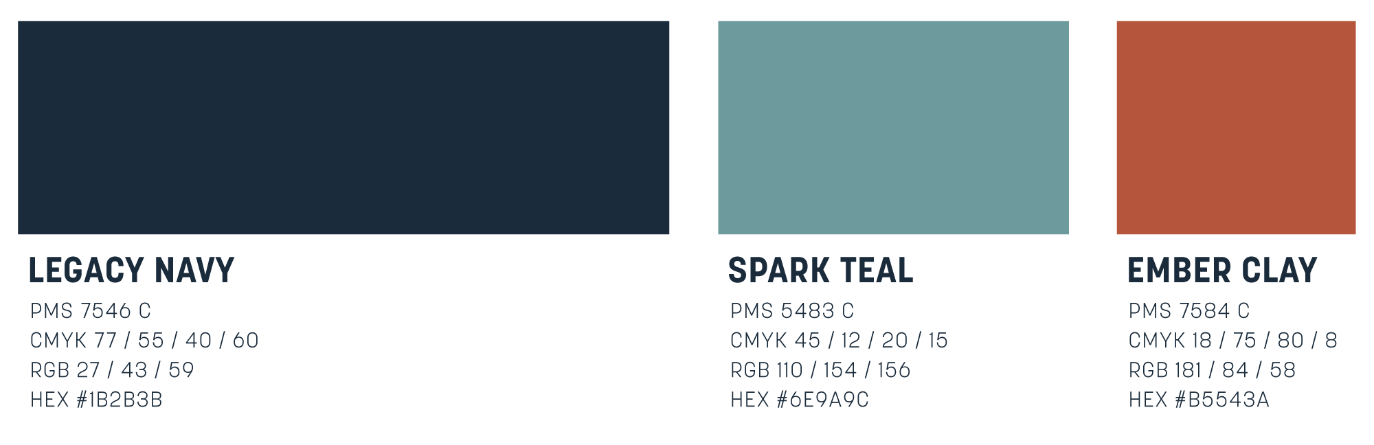
Color plays a key role in how our brand is recognized and remembered. The ASB palette is a modern interpretation of red, white, and blue — a subtle nod to our name, American Solutions for Business.
Legacy Navy anchors the brand in trust and longevity, reflecting the strength of the relationships we’ve built over time. Spark Teal brings energy and forward momentum, ensuring our presence feels current and engaged. Ember Clay adds warmth and human connection, representing the passion behind the work we do. Used thoughtfully and consistently, these colors create a brand that feels established yet evolving — strong, approachable, and unmistakably ours.
COLOR HIERARCHY
To maintain clarity and consistency across applications:
- Legacy Navy should lead and anchor most compositions.
- Spark Teal is used to activate, highlight, and introduce energy.
- Ember Clay is applied intentionally to add warmth and emphasis.
For more guidance on applying the ASB color palette—including color balance and supporting tones—visit our Detailed Color Usage guidelines.
DEFINED BY
TYPE
Typography shapes the voice of our brand. It brings structure to our message and clarity to our ideas.
Korolev provides a clean, modern foundation — confident, direct, and highly legible. Susan Classic introduces balance and refinement, adding a sense of heritage and credibility. Kinescope is used selectively to bring warmth and personality, reflecting the human side of ASB. Together, these typefaces allow the brand to feel established yet current — structured but approachable — ensuring every message is clear and consistent.
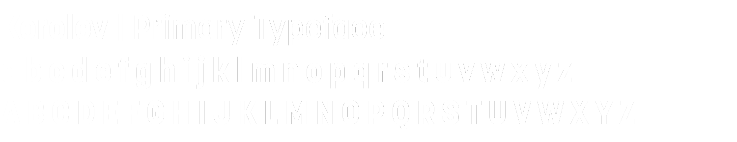
Korolev is the primary typeface of the ASB brand. Its clean, contemporary forms reflect precision, confidence, and forward momentum. Korolev should be used for:
PRIMARY TYPEFACE
- Headlines and subheadlines
- Brand statements and key messaging
- Digital and print marketing materials
- Logos, signage, and high-visibility applications
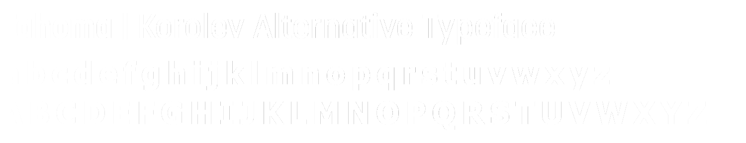
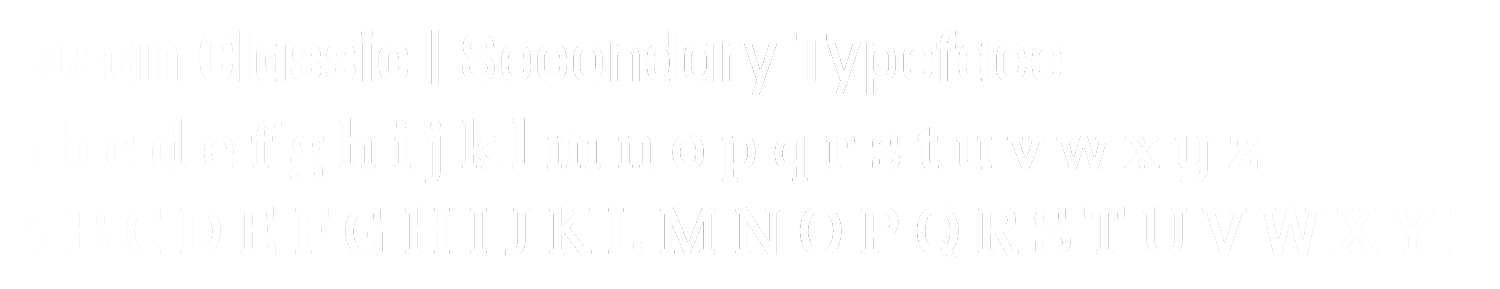
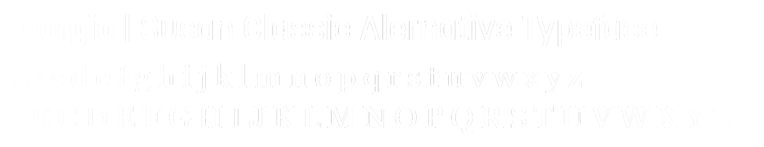
Susan Classic brings a refined, editorial tone to the ASB brand. It adds warmth, balance, and sophistication when paired with Korolev. Susan Classic should be used for:
SECONDARY TYPEFACE
- Body copy and longer-form text
- Supporting content and descriptive copy
- Editorial layouts and storytelling moments
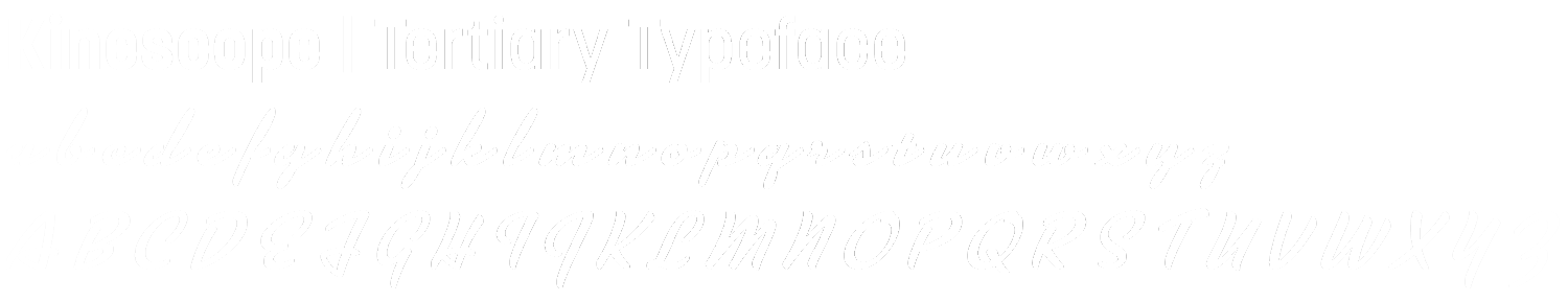
Kinescope is the accent script of the ASB brand. It brings warmth, movement, and human character to select moments, adding contrast to our structured primary and secondary typefaces. Used for:
TERTIARY TYPEFACE
- Accent words or short phrases
- Call-outs, pull quotes, and highlights
- Signature elements and emphasis details
DEFINED BY
PRACTICE
Our brand comes to life through how we use it every day. When each of us applies the ASB logos, colors, and typography with intention, we create a brand that feels familiar, trustworthy, and unified. It’s the collective practice of using these standards correctly that strengthens recognition and ensures the ASB brand is clear and consistent wherever it appears. Thank you for upholding our brand with care and intention.
To get started, download some core ASB brand assets here:
If you have any questions reguarding our brand, connect with us at marketing@americanbus.com